"Green abstract"


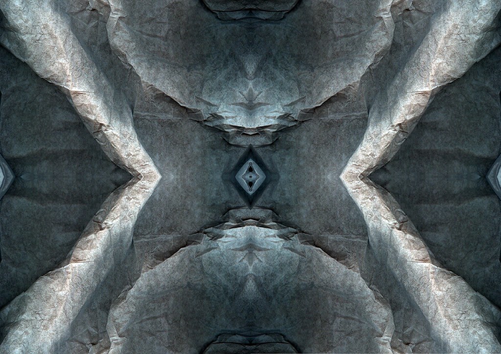
I know this is already on the little slide show, but the slide show doesnt really show it for long enough for you to study it, but you can now. Thought I would post it above the blue abstract as it a very similar piece.
![]()
I know this is already on the little slide show, but the slide show doesnt really show it for long enough for you to study it, but you can now. Thought I would post it above the blue abstract as it a very similar piece.
![]()
3 comments:
This puts me in mind of a kaleidoscope. I like the way the formations draw the eye and you find yourself examining the squares and comparing the images. It puts me in mind of a creatively mashed up make-up pallette - when magazines carry out beaty shoots they try and bash eyeshadows to generate texture and a colour depth and I think this is the effect they (and myself when I have tried, and failed, to do it) have been seeking!
Swanky and sweet. Naughty but nice! Liking the titchy cubes that scatter the details around abit. I know your not a sucker for alot of colours mixed (yes I did read ALL your comments), but I'd like to see sweetie getting invited to a colour party, some little hints of red, maybe a baby blue, colour combo's are another great factor to abstraction (as you've obviously discovered in some of the pieces.
Hey great description..... Swanky but sweet? Yes that what I was thinking. You've read all the comments; you serious, nice one means you're interested. Yeah I don't always enjoy colour combos, However if it’s done well and the colours don't clash too much its ok I guess. I'm now thinking the extrude tool is kind of a bit too obvious; I've decided I’m going to start to avoid the filtering stuff, as you know. I've actually got a version of this without the extrude tool, I’ll post it.
Post a Comment