The why Factor.......

I've done quite a bit of research into this so far and what seems to be case is that people have totally different opinions as to what have abstract photography is (all art is very opinionated) what I have been starting to do is to look at abstract art. Its definition is relatively simple. Abstract art is an art form which departs from natural appearances. Taking it to the extremes abstract art can be non-objective however as I've said before a photo can never be totally non-objective. Obviously as photographers we rely on what we see around us. I've always considered an abstract photo to be one that is unrecognizable. One of the ways to create an unrecognizable photo is to use macro and capture tiny details, detail you wouldn't necessarily recognize with the naked eye. However, thinking about it, is this really abstract. Capturing close up detailed, isn't the way of attempting to alter reality, because the camera is accurately capturing what we see. However, if you start to alter colours or for example use black and white you are actively altering what we see. Let's think about black and white. Black-and-white is non-representational of how we see the world and you could therefore argue that any black-and-white photo is abstract somewhat. However I don't want to take black-and-white photos thaI've done quite a bit of research into this so far and what seems to be case is that people have totally different opinions as to what abstract photography is (all art is very opinionated)
What I have been starting to do is to look at abstract art. Its definition is relatively simple. Abstract art is an art form which departs from natural appearances. Taking it to the extremes abstract art can be non-objective, however as I've said before a photo can never be totally non-objective. Obviously as photographers we rely on what we see around us.
I've always considered an abstract photo to be one that is unrecognizable. One of the ways to create an unrecognizable photo is to use macro and capture tiny details, detail you wouldn't necessarily recognize with the naked eye. However, thinking about it, is this really abstract. Capturing close up detailed, isn't the way of attempting to alter reality, because the camera is accurately capturing what we see. However, if you start to alter colours or for example use black and white you are actively altering what we see.
Let's think about black and white. Black-and-white is non-representational of how we see the world and you could therefore argue that any black-and-white photo is abstract somewhat. However I don't want to take black-and-white photos that are totally recognizable and argue that they are abstract, I want to do something a little more interesting than that. A black-and-white photo doesn't totally depart from naturally appearances because really for something to totally depart from natural appearances it must be unrecognizable and therefore the natural appearance of it must have been altered.
To physically alter an objects natural appearance in photography we must use techniques like blurring, which is moving away from exact representation. I would therefore also argue that Photoshop editing is a valid way of creating something that is abstract. Some people seem to really hate Photoshop, they feel that with Photoshop you can cheat, and create images quickly than would otherwise be quite technically difficult to do using only a camera. They feel that it's taking away the skill element. I can kind of see where they're coming from, but it's not always a simple click of a button on Photoshop. Layering up photos can become quite technically difficult in Photoshop. Depending on what you do, there is quite a bit of skill in using Photoshop well. For me Photoshop is brilliant and I really don't know where I'd be without it. I'm quite limited in a way I can photograph things, being quite weak physically in the upper body and particular my arms, due to having Muscular Dystrophy.
There are certain techniques in photography which I simply wouldn’t be able to do myself without help. Moving the camera to create a radial blur by moving the camera in circular motions would be impossible from me, but there is always a radial blur option in photo shop. Altering a photograph in photo shop in my view is most certainly a valid way of creating a non-representational and therefore abstract photo.

This was an idea I had a while ago (see this in my photography ideas) For these photos I filled a plain white vase with water. I wanted a perfectly white background and didn’t want to be able to see the glass. I used a red head light in the studio, and lit the paper behind the vase. Lighting it made a nice bright white background. So I then started to drip ink into it and I was pleasantly surprised with the way the ink reacted with the water, creating beautiful twirls and patterns. The light seemed to make the black ink appear purple, not sure why.

One of the great things with Photoshop is how you can layer stuff up. As you can see there’s white & black lines running through. This tells you there are two layers. Now the one layer was a desatured inverted version of the original and the other layer is just a desaturated version. I placed the desaturated version over the top of the inverted one. I made the top layer opaque (around 40%) which means the layer underneath showed through. I altered the levels, brightness & contrast and curves to add as much contrast as I could between the dark and lighter tones, so obviously the white is bright and black is really dark.... I much prefer bold, strong contrasty b&w imagery than pale delicate imagery.

Yeah I really can't think of a descent title for this abstract, and well is there really any point in giving it some long pretentious title. I think too much art is pretentious and well I really don't want to go down the slippery slope of pretentiousness. So perhaps I ought to give it away and tell you guys what the image(s) actually are, I wouldn't have done this but beings as this blog is part of my project I do really need to explain how I captured this photo. I said in my photography ideas lower down in the blog I would take photos of items of "glass wear” and so that’s what I've done here. These are images of a curvy s shape white glass vase. However to capture images like this one I have used a mirror. That white highlight you see near the bottom of the image, in the middle is the edge of the glass vase and the rest below is the reflection in the mirror. Now I have slightly edited this image but now filters have been used. What I had to do was use the clone tool to edit out what appeared to the like scratches or something. I've decided that I think the scratches were on the actual mirror which I didn't notice until I got the photos on a computer. I'm a bit annoyed because I thought most of the photos looked pretty good on the camera screen but it seems that most of these images show the scratches. Therefore, with the images I feel work best I will have to work on them a bit to edit out the scratches. I didn't do a lot else to this photo other than increasing the contrast a little, which added a little warmth to colour of the image which makes the image stand out. I've always most liked images that have a good bold contrast as I think they stand out really well. I'm not a great fan of these very opaque and pale photos some photographers create, but then it depends on what the photo is and sometimes the pale image does work, no doubt. Right, so why did I pick this photo from the contact sheets? Well obviously because its one my favourites, but why, there has to be a why. There’s reasons why I must have chosen this one to work on. It seems stupid but it always quite difficult to decide exactly why a piece of artwork attracts you. I don't like images that seem to be a mess of lots of different colours, there is something tacky about an image with all the colours of the rainbow, it’s just too much. I quite like images that are just one colour with different shades of that one colour. Perhaps this is what I like about this image because it’s beige with light brown with some dark brown which are similar colours and they just look right together. What else do I like about this photo? Well its got quite a smooth finish, its been taken on f/2.7 so most of the images is out of focus apart from the middle strip running through. I think the dark lines running through are what make this photo, without those lines the image would just be nothing.

This was desaturated and then invertred so the strokes running through are white and therefore stand out as against the dark background. The grdient shows up well hence the title I've given it. Looking at this more I think perhaps it works better than the red edit below as it stands out more and perhaps is therefore a little more dramatic.

Again I’ve just added this so you can view a bigger version of this abstract. As you can see this is the version with the spattered effect, which just adds a different textural quality to the piece. To go with the texture of the piece I've deliberately made the edge textured by scratching into it by using a grass blade shaped eraser tool in Photoshop. Just thought I'd try this just to experiment and to try something different, in the hope to try and display it in a more artistic manor.

I was taking some photos of a white vase using this small light I have (I will post the photos of the white vase very soon) After I had taken these photographs, some kind of overwhelming divine power took over my thoughts telling me I should photograph the bulb itself, so in answer to this I photographed it, funnily enough. This is the message I received from god "Lewis, I see the future, there’s abstract potential in this bulb, its up to you to capture it" now imagine that in a deep powerful voice....... so Anyway lol, I set my camera to f/8 (aperture) a small hole in lens because obviously there was a lot of light. Combining f/8 with a very fast shutter speed meant I could capture the filament inside a bulb without too much light burning the picture out. Now as you see above the original is on the top left, this is a reasonably interesting photo in itself, but it is by no means what I would call abstract, after all I do want to try and capture unrecognizable images, and it’s far too obvious it’s a bulb. I was interested in the filaments inside the bulb, so I got into Photoshop and straightaway used the crop tool and cropped out just the middle bit. I then reduced the brightness levels slightly and added lots of contrast of it, which meant the light stood out against a black background, as you can see. I was instantly happy with this, I wanted to do more to it and just see what I could create in Photoshop. I used the motion blur tool as you can see; I then used the colour gradient tool on the photograph. I did usual brightness and contrast tweaks until I simply thought it looked best, I believe art is about personal feel and you do what you personally think looks right. You release the shutter on a camera when you think every element of the photo looks correct, there’s this bloody great quote by Ernst Haas which I think is so right, nice one Ernst mate, that’s right on money. Here it is, you ready?
"My theory of composition? Simple: do not release the shutter until everything in the viewfinder feels just right"
I love that, its almost implying not to follow any golden rules, just do what you think is right, that’s what I do.
So back to the photo. I was rather pleased with the results of this edit, why? well its definitely abstract, I don't think any passer-by would instantly say well that’s a bulb, everyone who reads this now knows what it is though (dammit lol). I'm really not interested in actual subject matter I use; I’m more interested in creating ascetically pleasing abstract photographs. This image again kinda looks like a painting, it’s got a painterly effect to it. Bottom right, is a slightly different edit, I have applied a splatter effect, again giving it a painterly effect.
Lewis


I know this is already on the little slide show, but the slide show doesnt really show it for long enough for you to study it, but you can now. Thought I would post it above the blue abstract as it a very similar piece.

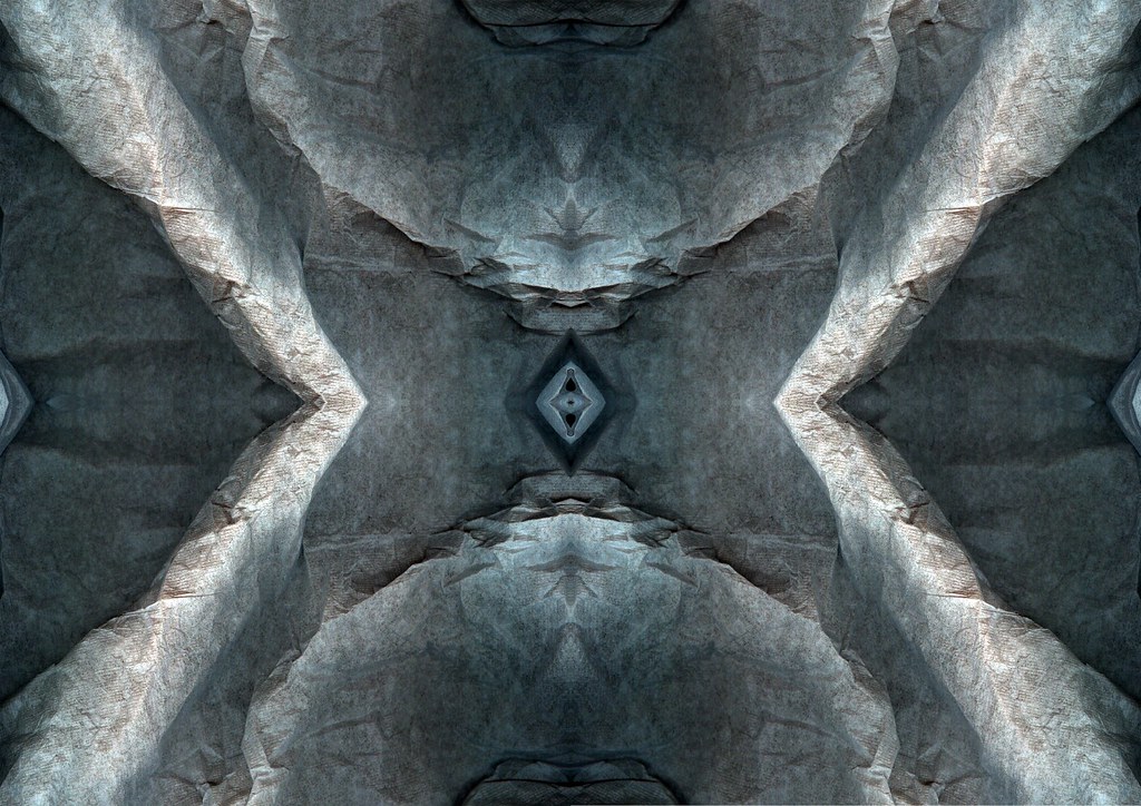
Thought I ought to post a bigger image, so you can take a closer look. Intesting pattern formations have emerged through the middle of the image by mirroring it. What do people think about the gaps I've added, do you think they add something to the image?
href="https://blogger.googleusercontent.com/img/b/R29vZ2xl/AVvXsEhKaiCG00Wx9bsxuoCLZHR2UsT9_AHcbYEPHZmucPFBwTsIYVGx-ey0lUDhJm7-wewcehrJ3W1xxjFseAMO269bt11qof_w0UhWpJOm8UzWlHcP8bjuLAZJ3LNdbhtMauc8AGu3xkOJOgI/s1600-h/page3+scans.jpg">
More experiments here using my scanner. I was thinking of scanning some plain fabric to captures the folds and curves of the fabric. So I gapped a pillow case, well mum did lol being as I can't reach, being a short arse, no because in a wheelchair lol. So I had the pillow randomly placed on the scanner making sure it was scrunched up. So I did a couple of scans (4 along the top) The images created were quite interesting with lots of dark and light tones. The lightest tones are the ones closest to the bed of the scanner and the darker tones being the parts of the pillow case furthest away surface of the scanner. I wanted to get rid of the black background like with the napkin scan, for the same reason. Again I gave it more contrast. I then simply inverted the image, and added a photo filter to create the pink tones you see on some of the edges. (bottom row middle image) I think it’s a striking image with those very dark heavy tones, in contrast to the light highlights in the image. Then I took manipulation a stage further as you can see with the red image I created. So I took the inverted image and added lots of motion blur. The motion blur didn't do much for the image, it just looked blurred lol, and there were no definite shades of colour or tones. However I then used the warp tool to add the curve you see. This instantly added more definite bands running through the image. It seemed to restore more detail and brought more colour tones to the image. It brought out that white band you see running through. I think the image looks kinda 3d, don't you think? Not sure how to explain why it does, it just appears to. Perhaps this image is going too far in terms of manipulation, what do people think? If I painted I would probably create images of this sort, I'm using Photoshop as a means of creating these, cheating some might say, but I would most certainly argue against this because creating these images doesn't happen instantly. To get from the original image to that red image didn't happen instantly, it took a certain amount of time and persistence. Painting isn't an easy option for me, having md makes it a real struggle nowadays. I use computers for everything, and I’m still developing my Photoshop skills.
Lewis
Just found this photographer called Jesse Cohen. One of her abstract images is really similar to the red one I've done here. Its got this 3d feel create with curves, kind of like mine. Hers arn't manipulated in photoshop shes deliberatly create the abstract blurred effect with the actual camera. to see this photo by Jesse Cohen, follow this link:
http://www.cohenphotos.com/atf2.html


