"napkin edit"

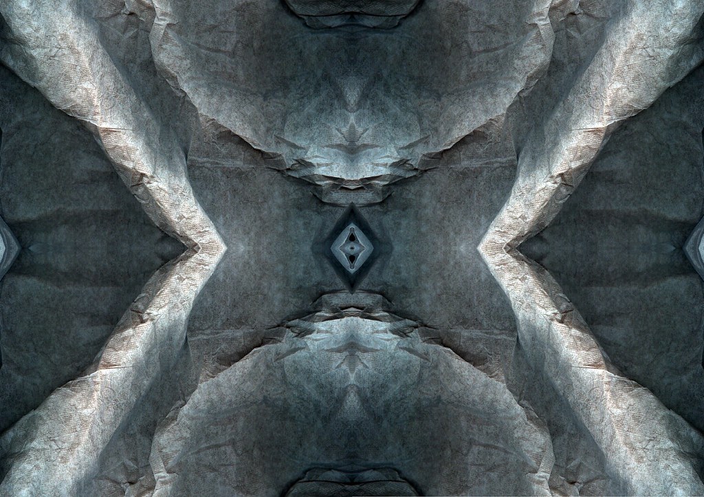
First cut out a section of the napkin, basically cut out as much as I could with getting any of the black background because I really didn't want any of the background because it would stand out like a sore thumb and therefore lead the viewers eye straight to it therefore distracting the attention away from the actual image. Ok I then increased the contrast and brightness levels a little to make the image stand out some more by bringing out the shadows and highlights. I added a hint of turquoise blue to the image and thought this tone stood out better than the others. I find that the image almost appear to look like the side of rock face, with jagged edges.
![]()
2 comments:
like the texture in these lewis. the subtle use of colour is akin to my taste as well. definately keep on experamenting with these kinds of ideas. plastic bags are nice as well
yeah I've been experimenting with manipulating a scan of tin foil which is most certainly abstract, I'll post it very soon artbeast..... I've got loads to post.
Post a Comment