
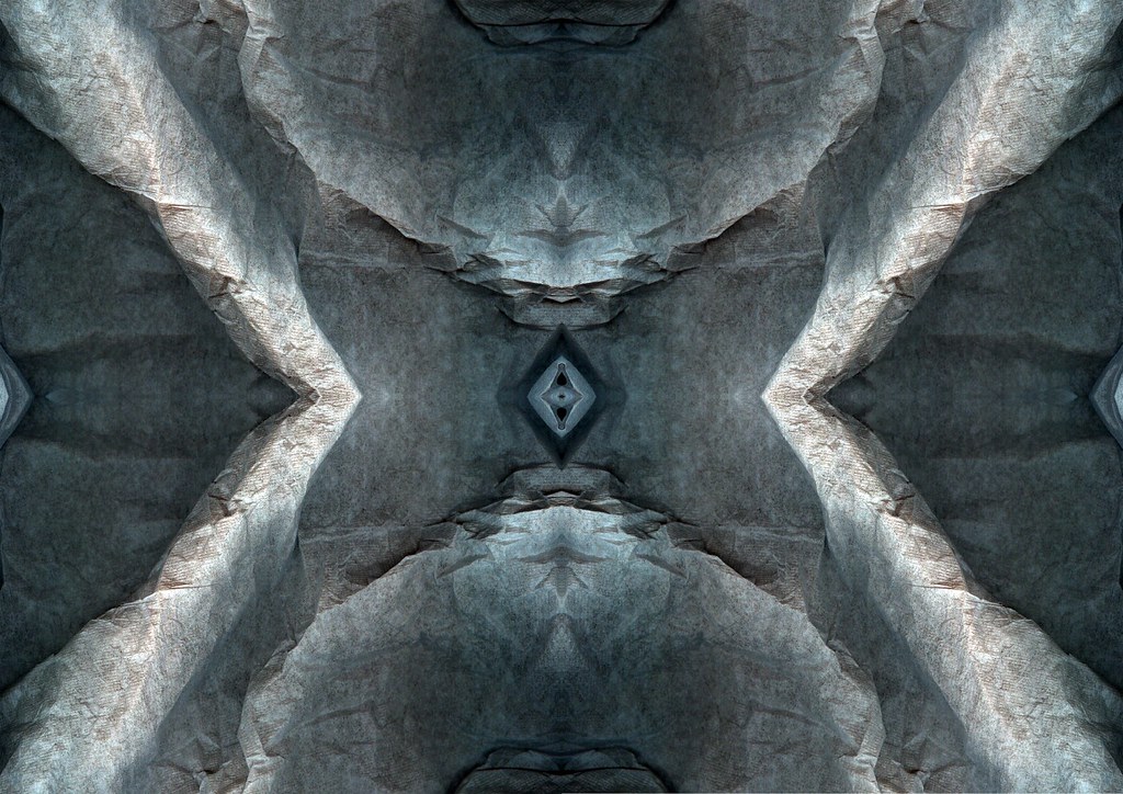
Yeah I really can't think of a descent title for this abstract, and well is there really any point in giving it some long pretentious title. I think too much art is pretentious and well I really don't want to go down the slippery slope of pretentiousness. So perhaps I ought to give it away and tell you guys what the image(s) actually are, I wouldn't have done this but beings as this blog is part of my project I do really need to explain how I captured this photo. I said in my photography ideas lower down in the blog I would take photos of items of "glass wear” and so that’s what I've done here. These are images of a curvy s shape white glass vase. However to capture images like this one I have used a mirror. That white highlight you see near the bottom of the image, in the middle is the edge of the glass vase and the rest below is the reflection in the mirror. Now I have slightly edited this image but now filters have been used. What I had to do was use the clone tool to edit out what appeared to the like scratches or something. I've decided that I think the scratches were on the actual mirror which I didn't notice until I got the photos on a computer. I'm a bit annoyed because I thought most of the photos looked pretty good on the camera screen but it seems that most of these images show the scratches. Therefore, with the images I feel work best I will have to work on them a bit to edit out the scratches. I didn't do a lot else to this photo other than increasing the contrast a little, which added a little warmth to colour of the image which makes the image stand out. I've always most liked images that have a good bold contrast as I think they stand out really well. I'm not a great fan of these very opaque and pale photos some photographers create, but then it depends on what the photo is and sometimes the pale image does work, no doubt. Right, so why did I pick this photo from the contact sheets? Well obviously because its one my favourites, but why, there has to be a why. There’s reasons why I must have chosen this one to work on. It seems stupid but it always quite difficult to decide exactly why a piece of artwork attracts you. I don't like images that seem to be a mess of lots of different colours, there is something tacky about an image with all the colours of the rainbow, it’s just too much. I quite like images that are just one colour with different shades of that one colour. Perhaps this is what I like about this image because it’s beige with light brown with some dark brown which are similar colours and they just look right together. What else do I like about this photo? Well its got quite a smooth finish, its been taken on f/2.7 so most of the images is out of focus apart from the middle strip running through. I think the dark lines running through are what make this photo, without those lines the image would just be nothing.
![]()
1 comment:
That waterdrop just stands out like a sore thumb I think. (top left) Perhaps the image would be enhanced if it was more chrisp and detailed on the right.
Post a Comment